Best Examples of Interior Design Principles in Miami, FL
This is the first of a series of blog articles on interior design within the major cities of the U.S. We wanted to explore the styles and ideas that designers and decorators use to exemplify the tastes and preferences of the various regions of America. We decided to start with a city close to our hearts, Miami, Florida.
Miami is one of the most popular vacation spots in the world. It has developed over the years as a versatile and enticing place to live, as well. The glorious weather, the ocean, and the beautiful homes and condominiums have beckoned snowbirds from the north as well as visitors from South America and Europe to embrace the same variegated lifestyles of Miami’s year-round residents. Not only does it boast the trendy nightlife of South Beach and the Art Deco District, but Little Havana and the exciting Calle Ocho, not to mention Lincoln Road and Wynwood, all offer fun and excitement. Miami Beach with its hotel-row of glamour, and Coral Gables and Coconut Grove, steeped in history and art, all have excitement to discover.
The reasons people decide on homes in Miami are many. Deep sea fishing, beautiful sand beaches, harbors to park yachts, year round golf and tennis, boat and auto shows, major league sports teams are just the beginning. Miami boasts a symphony orchestra and ballet company, as well as many museums, art galleries, live theaters, and outdoor parks, and it is in close proximity to the Everglades. Their international airport makes it easy to get around, and it is known as the cruise capital of the world. There is no shortage of art festivals, wine festivals, food festivals, and music festivals. You could call Miami the city of festivals. The restaurants are world class, and the Cuban influence in food, drink and music spice things up.
Miami is a colorful, cosmopolitan city, reveling in its ethnic diversity. Its sunny climate and natural beauty continue to make it a prime tourist destination. On islands offshore, east of Miami across Biscayne Bay, are the luxurious resorts of Miami Beach, Surfside, and Bal Harbour. These communities, as well as fashionable Key Biscayne to the south, connect with the mainland by causeways, and offer even more deluxe residences in both high rise condos and luxury homes.
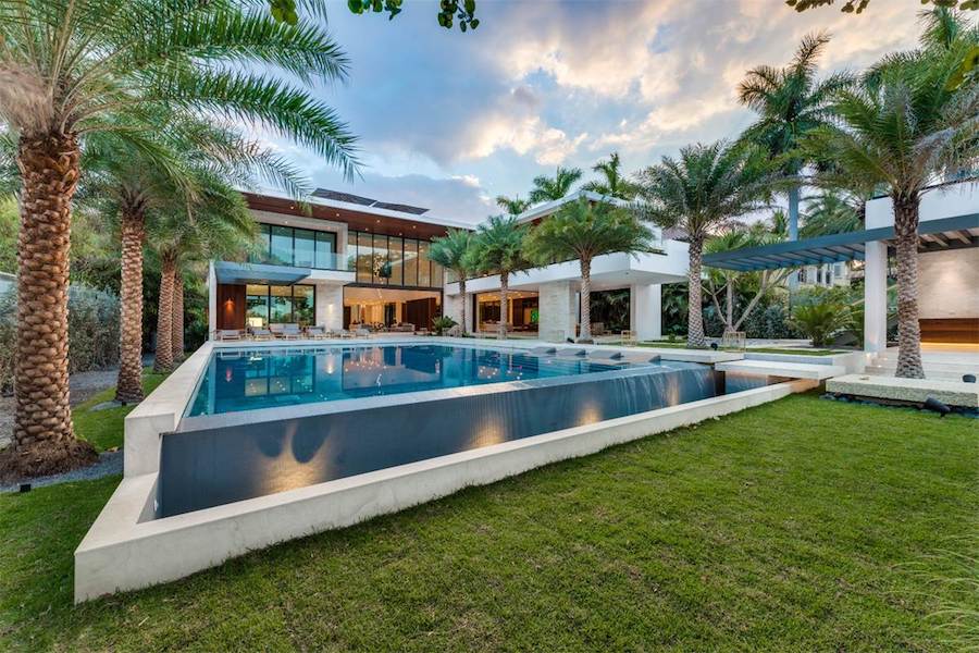
As a result, interior designers and decorators are in no short supply. Miami lends a thriving creative energy to their output.
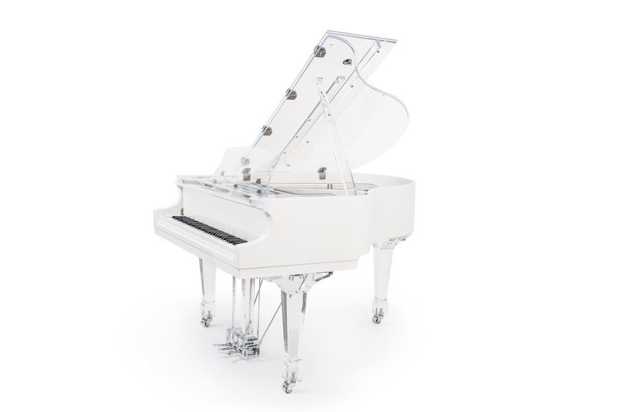
We love how Miami features pianos in their homes as well as in public venues all over the ciry. Here’s a Euro Pianos “Aire” baby grand photographed at Icon Brickell, the Fortune 500 Architectural & Design firm located at the epicenter of Miami’s business and financial district.
What Is Interior Design?
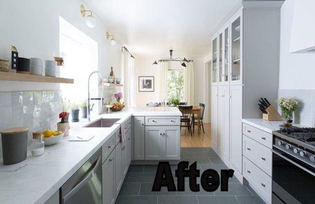
Interior designers are specifically schooled for dealing with the architectural, spatial, and design planning all the way from initial floor plans right down to placing the last accent couch pillow. They are schooled in color, fabric, furniture, computer-design, and architecture as well as usually doing apprenticeships with established companies before setting up their own shops.
These are highly trained professionals who must register and pass exams in some states. In Florida, interior designers who work on commercial projects must be licensed, but not for residential purposes. Interior designers often work closely with architects and contractors to help achieve the look the client desires, whether that client is designing a residential home, an office, a hotel, or any other interior space.
An interior designer can be actively involved in the physical renovation of a space, rebuilding elements, adding walls, etc. as well as sitting with the client on more detailed selections of color, fabric, style, and art. Their training is a soup to nuts package, and very versatile.
From the School of Interior Design:
“The surface of things gives enjoyment, their interiority gives life.”
—Piet Mondrian
Interior designers give life to the interior spaces we inhabit. They shape, organize, furnish, and adorn the insides of buildings to reflect our personal and cultural aspirations. Today’s interior designers do not simply decorate. They consider meaning and identity, function and purpose, and issues pertaining to health and safety. They work on wide range of interiors, from residential to corporate projects, designing spaces within new buildings and finding ways to adapt and re-purpose existing structures.
What Is Interior Decorating?
Interior decorators do not necessarily go through formal training, like designers, because their focus is an aesthetic approach to an already existing space. They don’t usually participate in the structural or renovation projects that might precede the actual decorating of a room(s), since often any structural work is complete before they come on board. They do however work with furniture makers, upholsterers, and other industry-related teams, depending on what is needed. They have contacts and resale licenses to accomplish the little miracles of finding the right item for the right room.
They have likely been schooled in various programs or courses on the principles of design, color and fabric, furniture layouts, styles and more. They are dedicated to the task of helping clients decide on a style, choose furniture and accessorize. Frequently they are hired to update or redo a space already decorated but possibly dated.
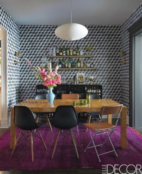
Example: Pairing high ticket items with budget items for creative visual appeal
We liked the way this Aire™ baby grand’s crystal sheen intertwines with that of the chandelier above, lending a feeling of warmth, elegance and intimacy to the room.
Should You Hire A Designer Or A Decorator?
If you are planning on major renovations involving demolition or structural additions, like walls, plumbing, doors or windows, it would make sense to hire a designer with the savvy to work with blueprints, architects and building codes, etc. They can take it from the top to the finished room.
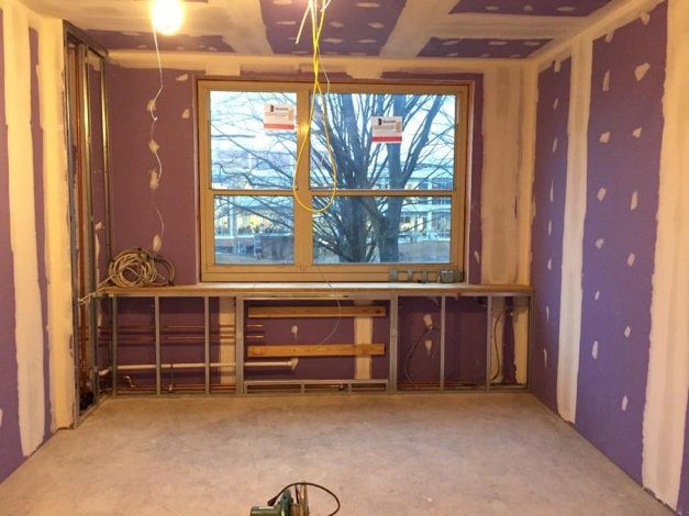
On the other hand, if you are seeking someone who is a stylist with great taste and innovative ideas to work on a room that just needs a facelift, an interior decorator can be a godsend. Choosing paint color alone is a major skill. Wallpaper, furnishing, window treatments, lighting, are all important in the overall finished look, and a good decorator can get you there with flair.
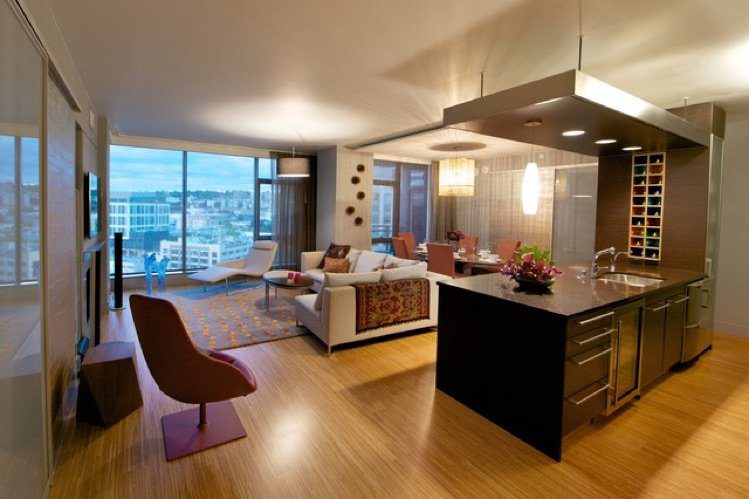
In the real world, clients usually spot a room(s) they like and want the name of who inspired that décor, so the right choice for you might be either a designer or a decorator because they ultimately are capable of doing the same things if there is no renovation or structure changes.
On the other hand, an interior decorator with a lot of experience in the field may have a coterie of contractors and architects to confer with, so it helps to interview and research your choices no matter how you come by them.
How Design Principles Are Used In Miami Florida
UNITY
To understand interior design, you need to know the elements that comprise the art and skill of designing. The principle of UNITY might also be thought of as “harmony” and is the force that pulls all of the other design principles together. When successful, the elements should complement, that is, complete each other and visually “fit together” in such a way that their style and composition seem inevitable.
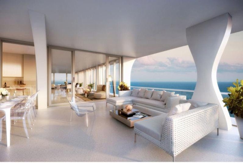
Unity can be achieved by a solid knowledge of space and alignment. Similarity of color, pattern and textures, with groupings and repetition of shapes and colors are just a few of the ways to unify an interior design arrangement. Variety is the complement to unity and is needed to create visual interest. Without unity, a room is chaotic and without merit. Without variety it is dull and uninteresting. Too much unity creates monotony, too much variety creates chaos.
In the room above, the curved architectural elements are echoed in the curves of acrylic chairs and dining table legs. To add variety, the sofa pieces and coffee table are straight lines and that makes the eye travel from shape to shape. The color white unifies the room as well. But note that the camel color of the coffee table picks up the camel of the indoor furniture as well as the camel colored walls of the wet bar. It’s subtle but well planned and pleasing to the eye, without knowing quite why or how something so simple is sophisticated.
BALANCE
The design principle of BALANCE is another way distributing elements of equal visual weight to achieve a visual equilibrium. Balance is normally sought by using one of three techniques: The first is Symmetry. In using symmetrical technique, the room is divided into two equal halves centered from a central point (real or imagined) and both the halves are equally balanced to be almost mirror images
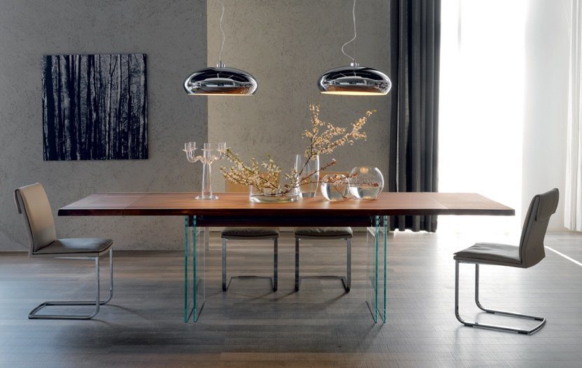
This, to many people, gives a feeling of calm to the living space. Symmetry is a very common “trick” to calm the human brain. We seem to like the visual of all things being equal. Although there are a few elements not “mirrored” above (the painting, the drape, the glassware), the weight of the matching chandeliers and the table and chair placement throw this into visual symmetry. Symmetrical designs are always pleasing, if not occasionally boring. Asymmetrical designs are bolder and can bring real visual interest and movement
Another balancing technique is using Asymmetry. In Asymmetrical, any number of disparate elements can be used by keeping an imaginary central axis as the focal point. Though asymmetrical balance is not as simple to imagine as symmetrical, the results can be very gratifying, more natural and energetic when compared to the former. Fine art is normally encouraged to represent the asymmetrical, so it is not static and predictable. In art, the eye should travel, and in asymmetrical design takes the eye on a voyage as well.
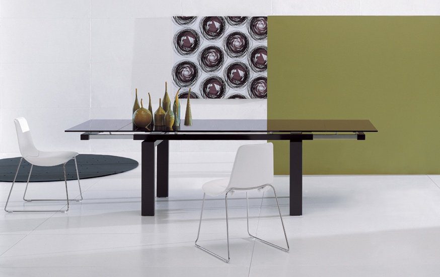
The focal point of this room might be where the green wall stops, off center. The objects are then placed in asymmetrical relation to each other, but with the wonderful “echoes” of clustered objects (wall & table items) and color (green echoed in table items) and balance of weight with the black rug. It makes a delightful visual.
The third balancing act is the Radial balance which involves a central piece focal point (like a round dining table) from which all other elements seem to radiate to arrange themselves in in a radial pattern.
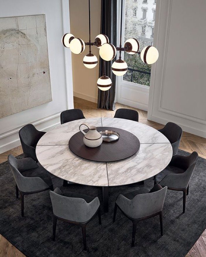
The concept of radial balance can be used in a lot of ways, just using circular shapes, spiral staircases, round ottomans, round coffee tables, etc. It’s just another design trick in the bag of goodies to choose from.
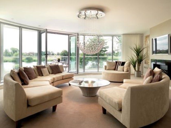
You’ll note in the living room above that the radial elements have been chosen to enhance the curve of the windowed wall that shows the outdoor scenery, balancing nicely.
RHYTHM
The principle of Rhythm is associated with all of the arts. Notably music. In fine art, the eye moves around the canvas, connecting the elements. This creates a kind of rhythm and tempo between values, light/dark, thin/wide, bright/bland, etc. A wonderful example of artistic rhythm is in the 1931 Grant Wood painting “Young Corn.” The rhythm of the painting is self- explanatory. It fairly leaps off the canvas. You can see the use of repetitive elements, and flowing elements, progressive (in size) elements, and alternating elements. From a design point of view, this painting has it all.

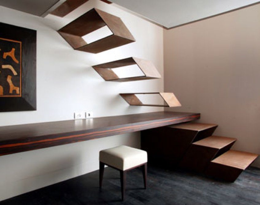
Likewise in interior design, there are methods for creating desired rhythms, connecting elements like the musical beats in a song or the visual elements in a painting. Unlike pattern, which demands consistency, rhythm relies on variety.
The easiest method is Repetitive or Regular Rhythms (not unlike the repeating chorus of a song). If a design uses similar sized and shaped elements, with defined spaces around them, a movement of rhythm is created. Unlike pattern, which demands consistency, rhythm relies on variety.
The repeated use of the design elements like color, texture and pattern or any other attributes or items in an orderly way.
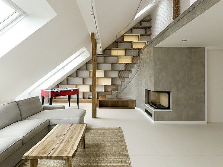
Alternation creates rhythm by alternating two or more elements. You could even create a particular negative space between items that would force the eye to see the space as an item itself. In the room below, the alternating colors and boxes built into the wall force the eye to travel. By keeping the color simple, the varied and many shapes stand out, with the few colors becoming conduits for eye travel. Notice how the coffee table echoes the colors of the wall boxes. The red item becomes a focal point in the room without even trying. (see Emphasis below
EMPHASIS
In Progressive Rhythm, elements are arranged ascending or descending based or their size, color gradient or any other distinctive characteristic.
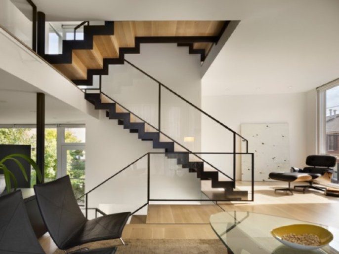
Emphasis, as the name suggests, is a principle of creating an area of the room that is visually dominant and commands attention. This is often achieved by contrast. (see below). It occurs when a central piece of art or furniture is the attention grabber of a particular space. Elements like color, pattern and texture are used to emphasize a particular focal point. Done properly, that focal point dominates the rest of the décor items and pulls the room together.
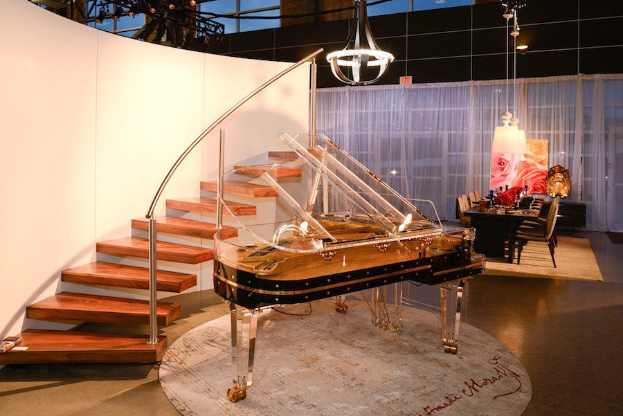
The focal point of this space is the acrylic grand piano. Even the winding rail of the staircase seems to be embracing the instrument, framing it. The lines of the stair rail and the chandelier echoes the architecture of the piano lid.
CONTRAST
Contrast refers to the difference in the brightness or color between objects differentiating them. Contrast is provided by color, form and space.
Color can be contrasted as easily as using black and white without actual color. Very dramatic design results can be achieved with contrast. In this room, the red wall emphasizes the tall ceilings of the structure.
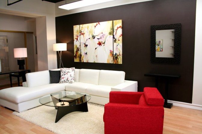
Contrast can be achieved by combining two or more forms; for example one can combine a circular mirror and a rectangular sofa to balance and distribute the attention between both items. Take a look at a nice mix of contrasts.
One can also achieve contrast in a living space by dividing the available space efficiently into usable positive and negative spaces. Sometimes less is more.
SCALE AND PROPORTION
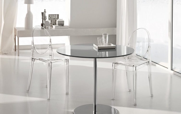
The principles of Scale and Proportion ensure that items in a room look like they belong to each other. Be it the size, dimension, shape or color of the objects, a harmony should be established between them and a proportion has to be maintained. Good sense would tell anyone that a huge overstuffed sofa wouldn’t use a tiny coffee table. A tiny room wouldn’t be full of huge furniture, and likewise a huge room wouldn’t be furnished with tiny pieces.
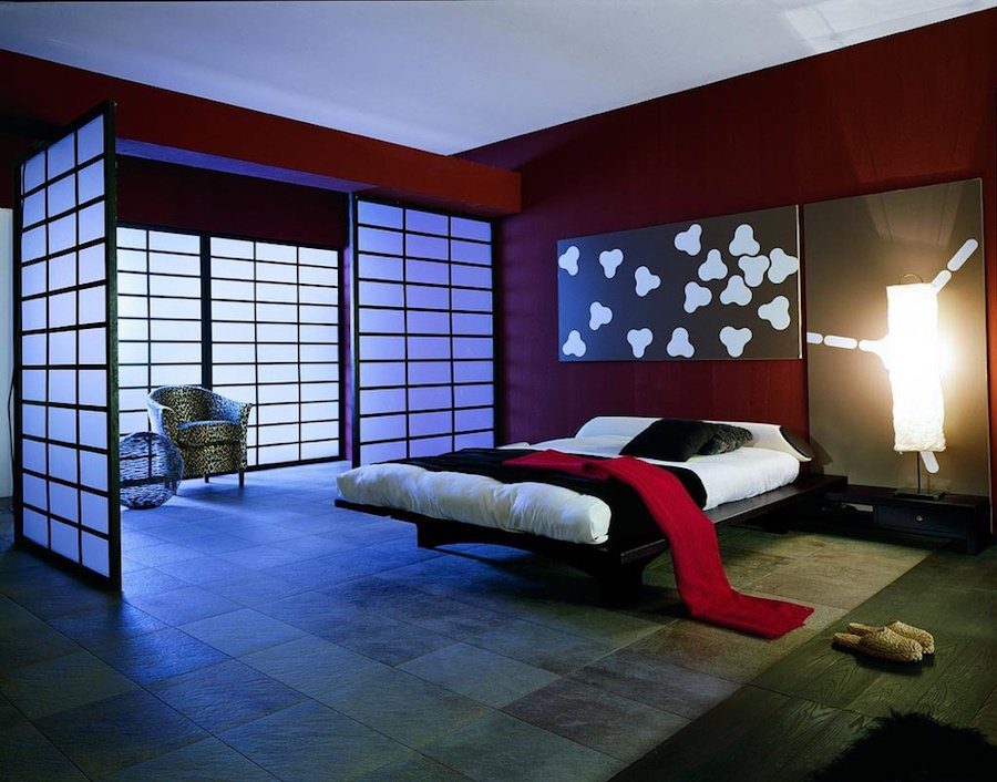
Here’s a large room that isn’t full of furniture, but the design elements (screens and art, color and textures) keep it in proportion—in spite of the scarcity of furniture.
PATTERNS, TEXTURE & DETAILS
Pattern is the uniform repetition of any of the elements of art or any combination thereof. Anything can be turned into a pattern through repetition. Some classic patterns are spirals, grids, weaves.
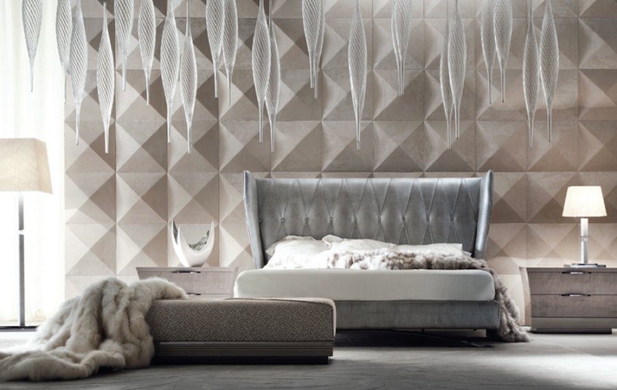
Designer frequently find pleasing Patterns and Textures in fabrics which can be the basis for an entire decorative inspiration, or focal point of a room. As you can see in the monochromatic bedroom below, pattern and texture has been used for the entire decorating focus. This is bold design for the client who wants singular and dramatic rooms.
Details add life to any overall interior design. By adding their own distinctive feature to the overall composition, decorators sometimes become known for their style in details alone. Once you are sure that you have achieved all of the above mentioned principles, it’s time for details to take over and beautify the place further.
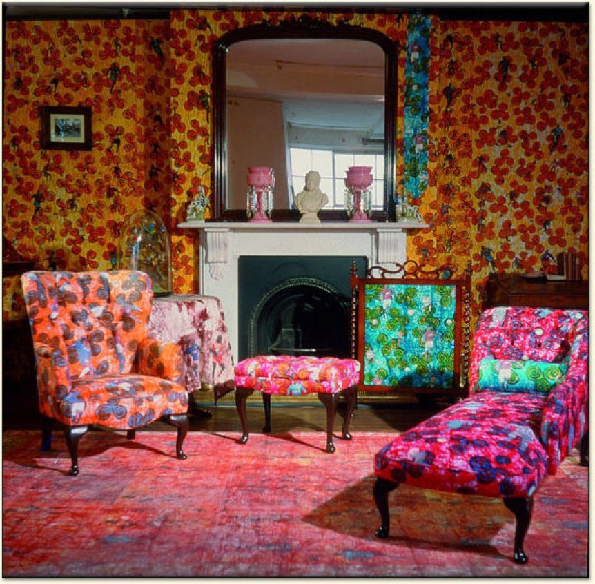
Just for fun, here’s a Yinka Shonibare Victorian room (not in Miami!) that went gung ho with Patterns. This art installation certainly wouldn’t be most clients’ choice, but you can’t say that pattern can’t be memorable!
Miami Interiors
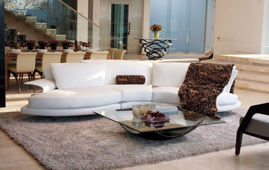
Now that we’ve reviewed what principles are applied in the interior design industry, let’s take a look at some of the results of the Floridian homes around Miami. See if you can spot the principles we discussed earlier in these beautifully crafted rooms.
The shapes and textures in this living room are breathtaking. Note the detailing on the acrylic staircase, the wonderful shapes of the sofa, coffee table and the art table in the background. Patterned fabric pillow and throw complete the so-rich-I-can-taste-it designs of this elegant room.
We’d love to add a baby grand to this ensemble. (that is the best part of interior designing for us). Imagine how the black or white Aire™ by Euro Pianos would look in this room, echoing the acrylics in play.
Below is an understated living room, using three contrasting colors in muted shades that create a peaceful and ultra luxe sophistication. We love how the artwork and the dark grey rug complement each other.
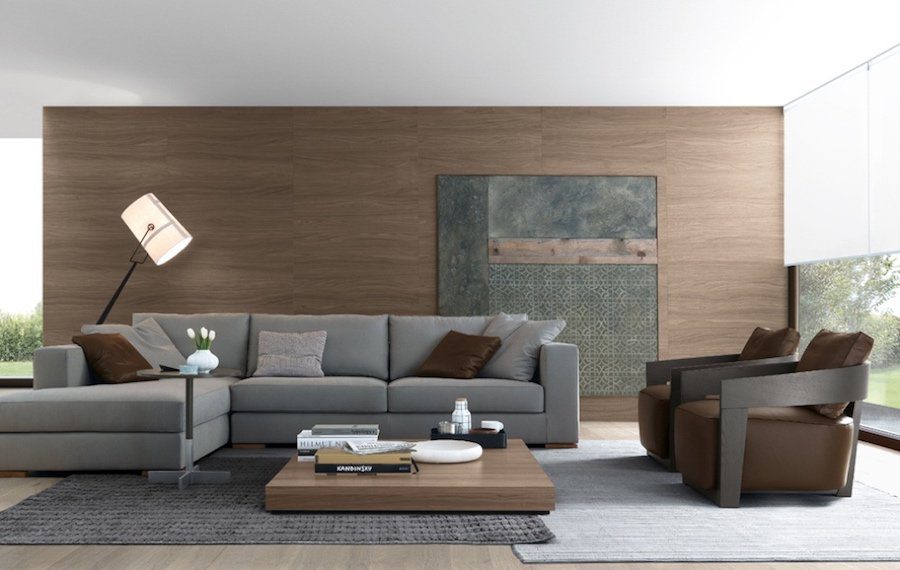
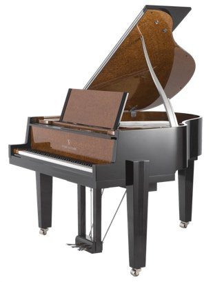
Given our druthers, we’d probably install the little Story & Clark “Manhattan 150” baby grand in this room. It’s got the same clean and simple lines this room demands.
Here’s a little Miami apartment that has all the design interest one could ask for. Using a white backdrop, this designing artist went wild with surprises in color and pattern that delight the eye. Check out the fantastic little dining chairs on acrylic legs.
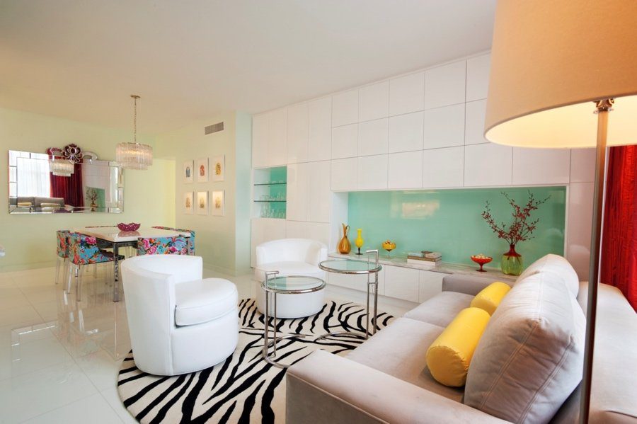
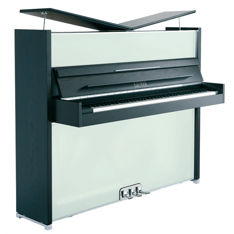
That wonderful green alcove and bar shelf reminds us of a little Peter Maly designed piano called “Vitrea” with cool front panels of frosted colored glass subtly set into shades of dark or light oak, Reminiscent of fine Venetian art glass, Vitrea catches the light, making it unique, surprising and memorable, hip enough for this unique space.
To see more designs and pianos, and information on decorating, go to our BLOG and read our educational and entertaining offerings. We will be back with more design articles on other cities, so watch that space! Let us know what you think and would like to see.
ABOUT EURO PIANOS NAPLES
Euro Pianos Naples is a respected distributor of European luxury musical instruments. The company’s origin dates back to 1965. Euro Pianos represents world renowned brands such as Sauter, and it has recently become a manufacturer of its own acrylic instrument – The Aire. Apart from being a successful retailer, consultant, and entrepreneur organization, Euro Pianos is actively engaged in the artistic and community life of Naples, Florida as an organizer and supporter of musical events throughout the years.


